Ricochet Remix + Lola Meringue
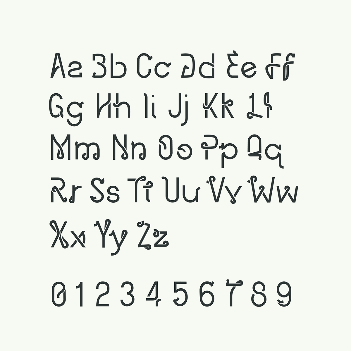
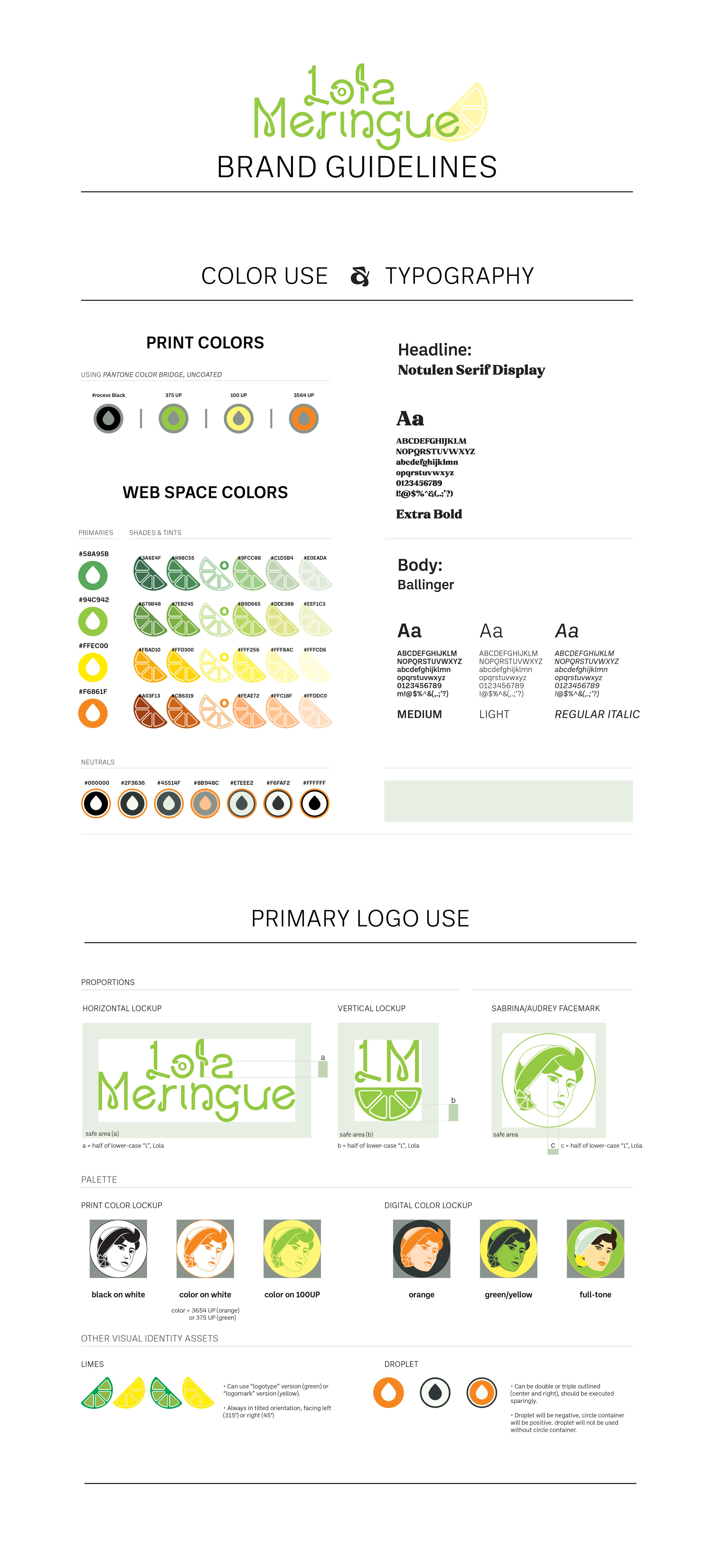
Worked on concept and execution, drawing/crafting letterforms as well as colors, logo and overall brand direction
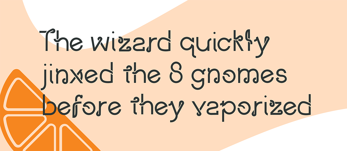
Ricochet Remix is a modification of a previous self-made font: “Ricochet”. The original alphabet is based on the concept of a rubber ball, or the movement of a ball bouncing against a hard object, combining smooth curves with hard breaks and lines in a fluent but bold visual statement. This font was remodified, using Stratos font as a base, into a more functional display font.
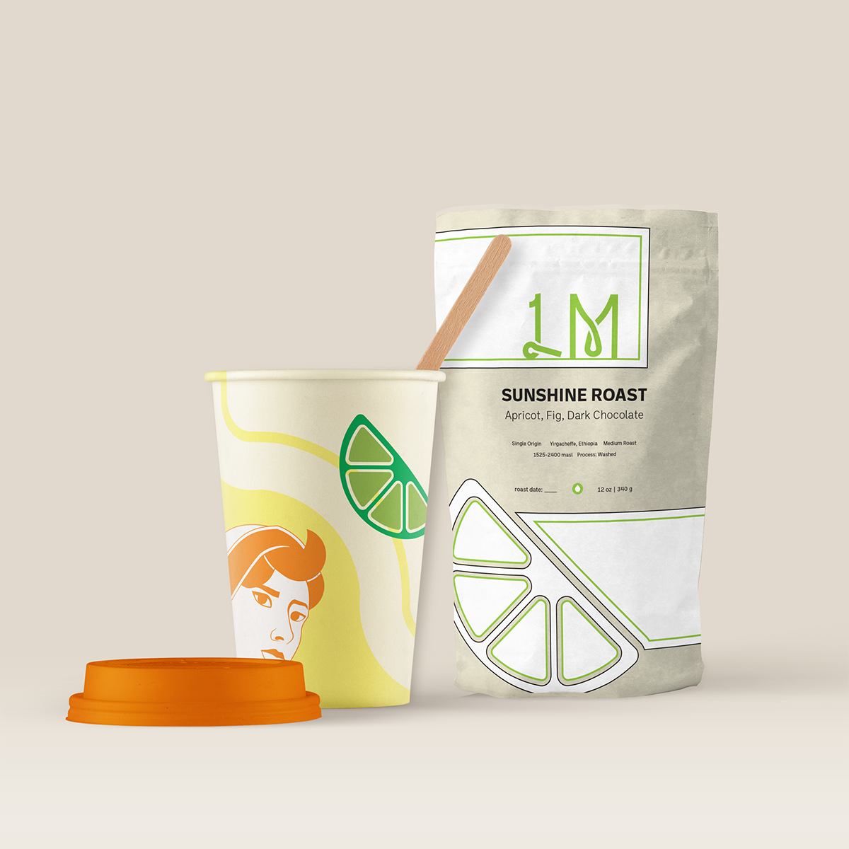
Using this new font, I was also able to build out a branding solution using the font as a logo and accent piece. Given the bouncy script-like qualities of the font, I decided upon a retro mid-century aesthetic, taking cues from the colorful, geometric statements of the era and playful fashions in vogue (such as the designs sported by Audrey Hepburn’s eponymous heroine in Sabrina)
Displayed below is a minimal interactivity app prototype: interactive elements are labeled in kelly green.


