AgriBioTech
Mission
In 2022, I reached out to Scientific Roots (with AgriBioTech) to help brand product. Their previous designs were true to their culture, but didn't fit the client’s vision. The client asked for a new direction / concept work in regards to three different ‘brands’ (the PONDO drink line, GetaFIX, and Carri-TAG / VectaMort). The designs were delivered in a timeframe of two months.
AgriBioTech is a South African non-profit with the goal of bringing scientific education to rural South African communities and to help future science leaders gain the support, tools and education they need to succeed in their respective fields. Patentable products are developed with indigenous plants and connect farmers in the agricultural sector to chemists and biologists who rely on their produce and livestock to develop products that are environmentally safe and ethically sourced.
Projects:
PONDO T-E-A
an energy drink and kombucha line of beverages that’s free of caffeine, sugar, and artificial ingredients
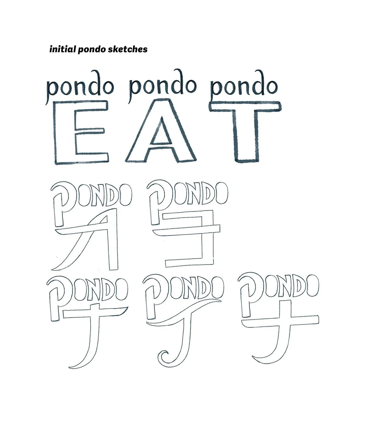
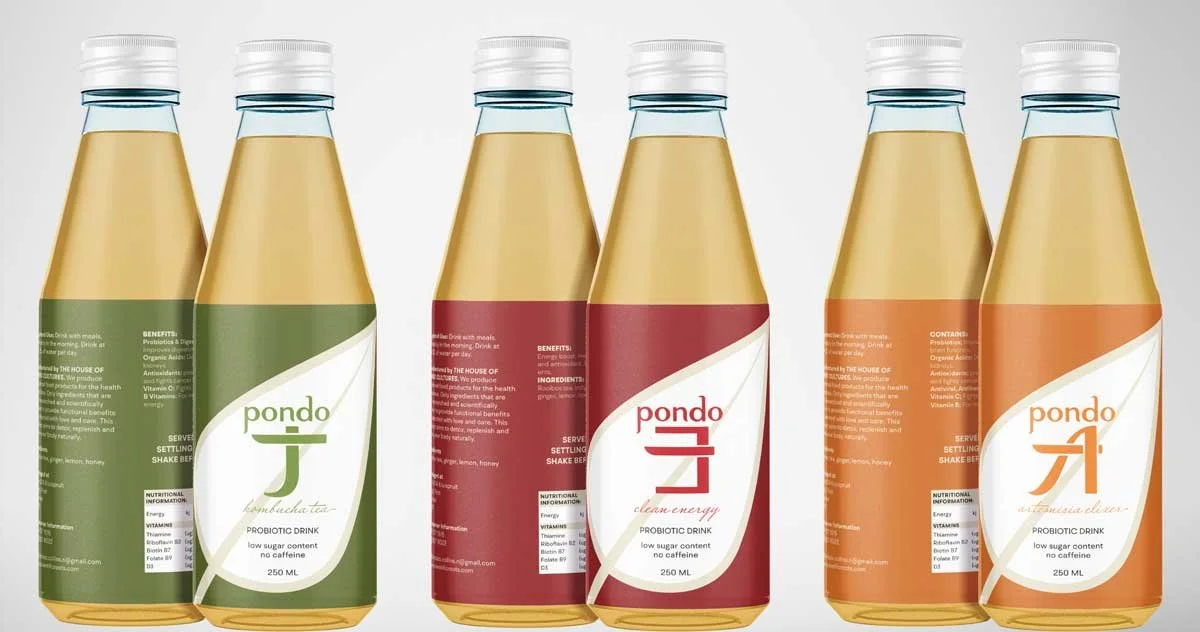
Developed PONDO logo-type for current and future projects through hand-vectored drawings. Used client brief to re-imagine bottle design, color schemes and overall brand direction.
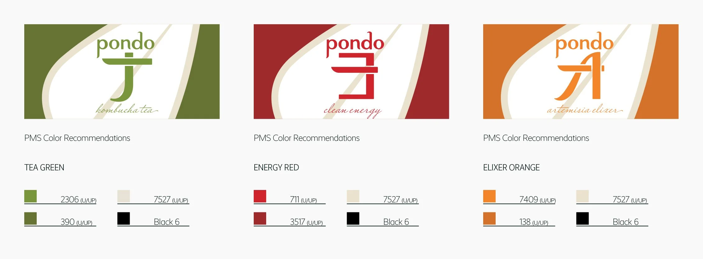
The client initially came to me for work that was both unique and clean, and spoke to the brand’s image and target demographic better. From the sketches above, I was able to hand-render a type-based logo for each current and prospective product line (as seen below)
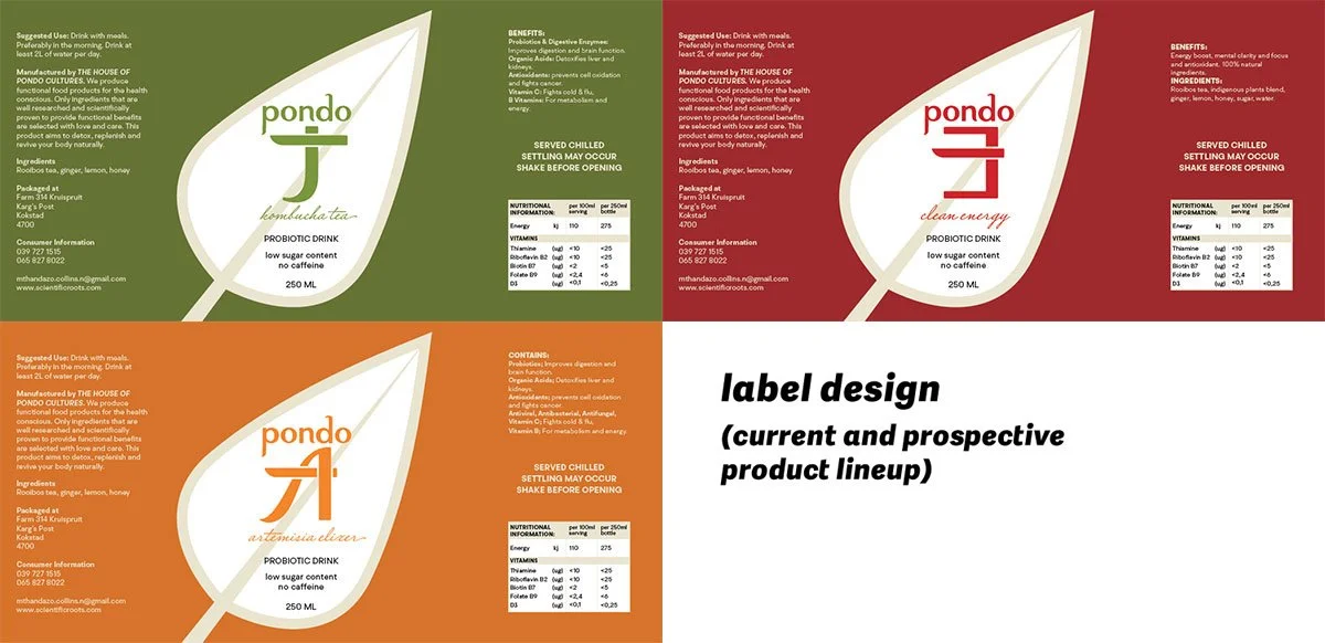
From these marks and from the client’s brief, I then designed a sticker label that best related to the target demographic while keeping elements and the spirit of the original design.
GetaFIX
an organic wound healing paste made with ingredients derived from indigenous South African plants
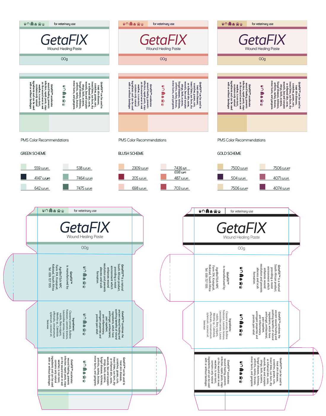
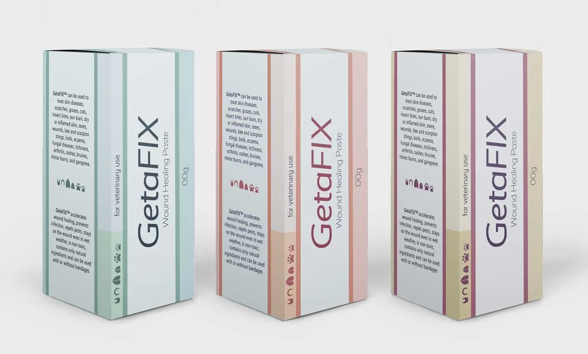
Developed logo and box design. Fitted direction to closely match client needs and act more competitively in an international market.
Most of the work with this project was focused on package design; the client needed a design that spoke more to the client’s intended audience while being flexible enough that it could expand itself into the international market. I came up with the logo design, and came up with palettes that are professional and eye-catching. The design uses elements from previous iterations that were directed to a narrower audience/more locally-focused scope.
Carri-TAG and VectaMort
Carri-TAG is a cattle tag that is designed with a compartment to hold items; VectaMort is a satchel that can be inserted into the Carri-TAG’s compartment in order to repel disease-carrying pests that often swarm around livestock animals’ heads.
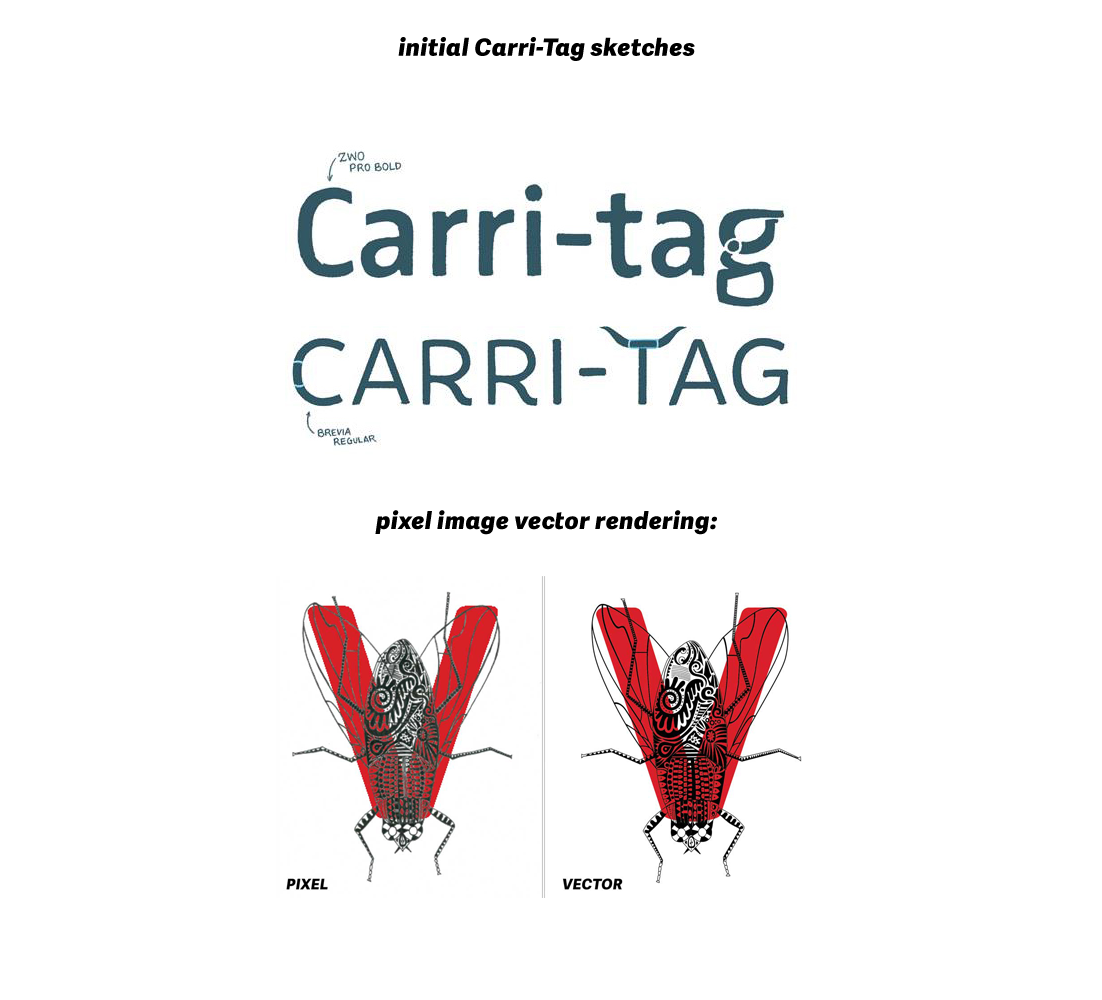
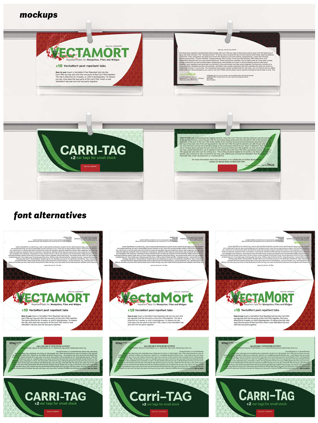
Conceived of novel concepts, hand-vectorized letter design (client-provided). Matched logo designs between brands, Designed product tags that were visually connected, but more streamlined and featured a more legible copy-space.
Client provided letter V mark from previous artist working on the project. I converted this design into a scalable vector graphic so that the quality of the lines doesn’t become obscured by scaling or file transfer. The design was then implemented in a word mark, which translated over to its ‘parent brand’ to create a cohesive visual message. The brands remain distinct while keeping their promotional relationship.

